
project name:
design intention:
miroBC
a mobile app that will help track food traceability and authenticity along the supply chain through the use of blockchain technology and create a food journey for the end consumer to view.
the challenge
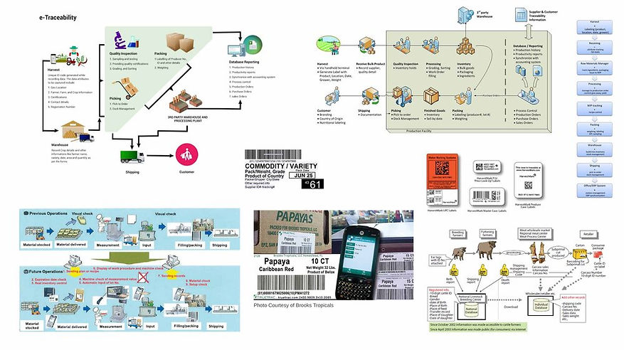
Food traceability is the ability to track food products through all stages of the supply chain back to its origins. Traceability has always been important for food safety, but now, with increased reports of food-borne illnesses, regulations are tighter. End consumers care about where their food comes from and often use this information to help decide which products to buy.
Lack of traceability and transparency can create blindspots in the supply chain and expose consumers to unnecessary risk. The lack of traceability in the food supply chain is typically caused by companies using outdated systems or traditional paper tracking and manual inspections.
How can we ensure the authenticity of produce and strengthen traceability of food through the supply chain as well as allow the end consumer understand this journey from farm to table?
the approach
Having and sharing authentic information from each and every step of the food supply chain aims to enhance food safety, strengthen brand integrity, and increase customer loyalty. Imagine a situation where you discover the story behind a product by using the information added onto the blockchain on each and every part of the product's journey through the retail supply chain. An app lets you see where it was grown, understand how many food miles it has traveled and more.
user research
Through interviews, I learned that people were not completely satisfied with not knowing where their food came from outside of the store they purchased it. Some common frustrations included mislabeled produce, non-labeled produce, and lack of understanding high costs of organic, ethically sourced foods.

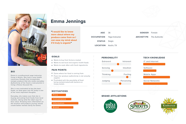
user personas
Through the research phase, key user group ideas emerged: the busy single fitness focused professional, those with food allergies and dietary concerns, as well as produce source-conscious working family. Each user group had specific beliefs, attitudes, and goals for grocery shopping, but they all shared some common characteristics, including the willingness to spend a bit more time shopping in order to verify a better product, and the desire to eat healthy, nutritious foods in correlation to the produce price.
brainstorming + mood boards
information architecture
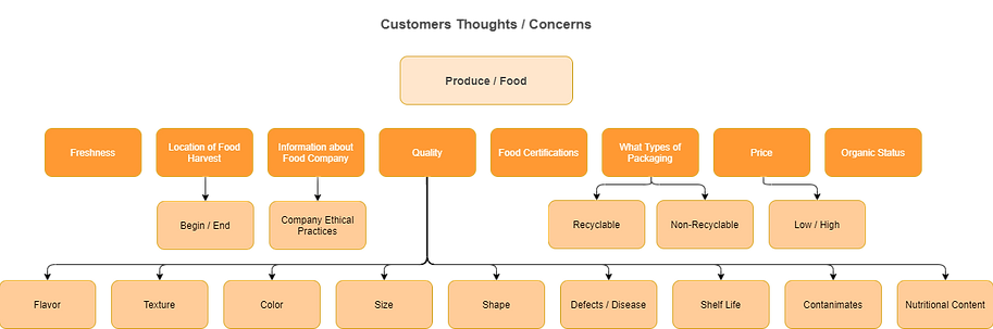
Understanding the hierarchy and sequence of the app design was a starting step to the visualization of the produce journey. Having the user see the grocery information from start to finish is one of the main goals for this product. I conducted a card sorting exercise to learn how people might expect to see produce arranged in an online grocery informational experience, in order to design interactions that would meet customer expectations of product transparency and traceability.
.png)
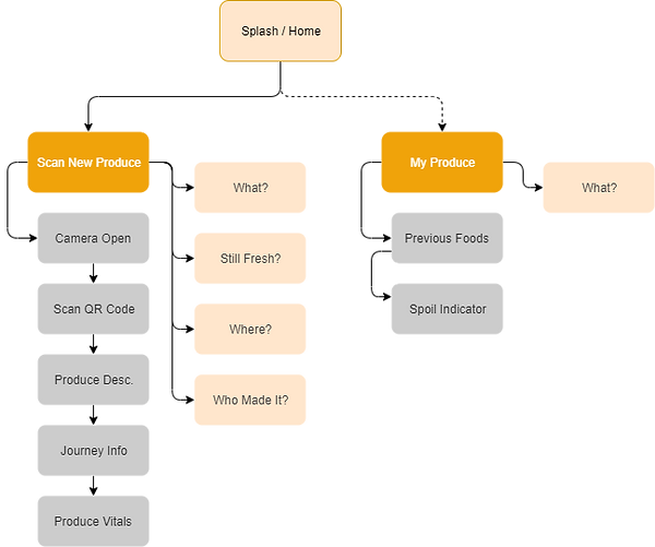
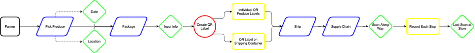
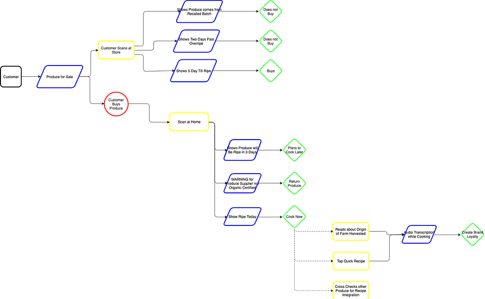
user flow
I then designed a user flow to demonstrate how a person might navigate through the proposed product. User flows help identify points along paths where users might be faced with choices and decisions, and also critical for preventing the design of dead ends that might leave users stuck and unable to complete their intended goals.
.png)
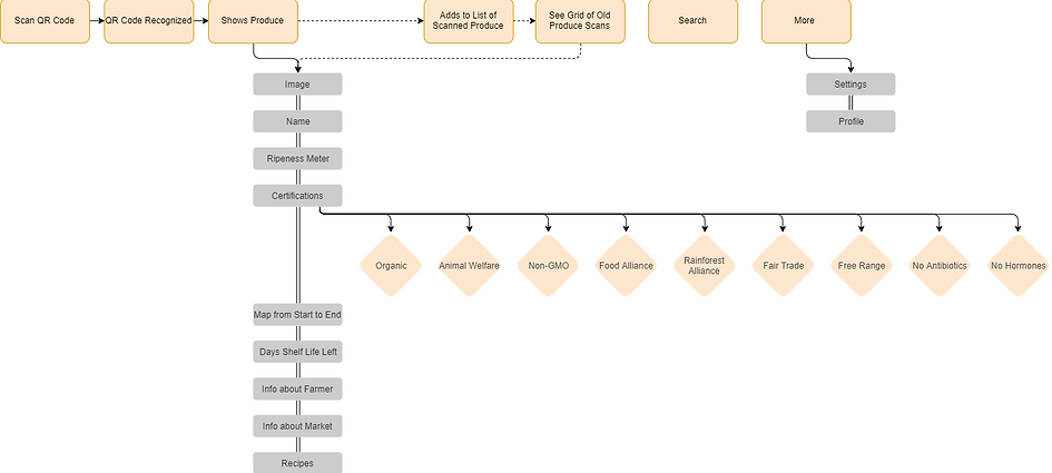
screen flow
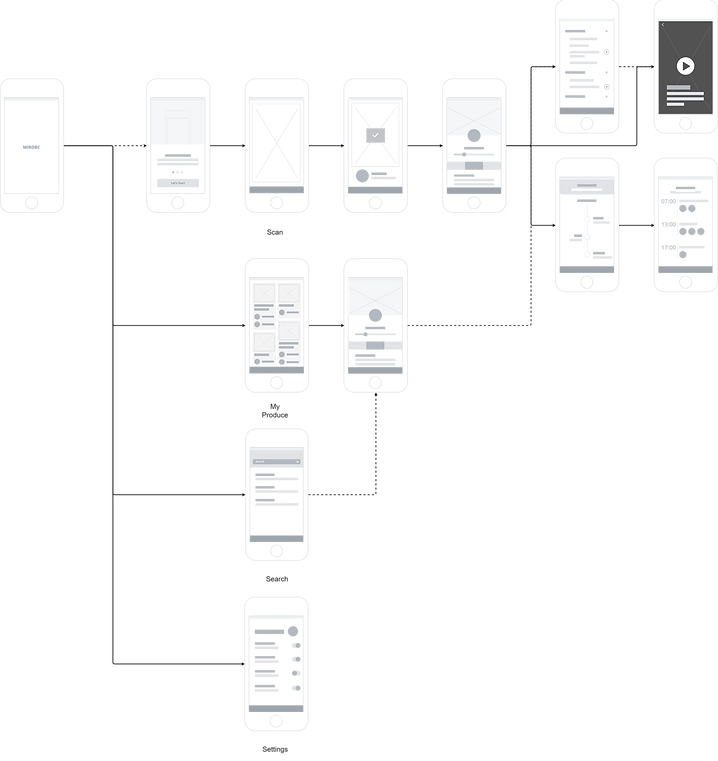
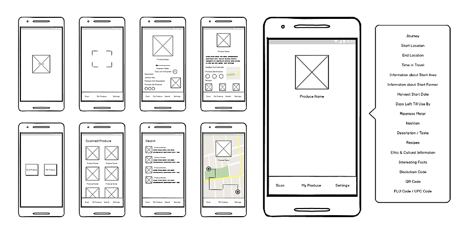
wireframes
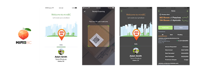
I reviewed my user flow and selected screens to sketch with pen and paper. I then used the sketches to guide the design of mid-fidelity, digital wireframes of mobile app screens.
mockups
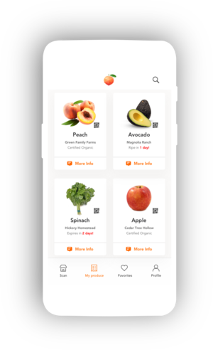
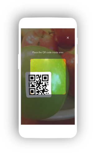
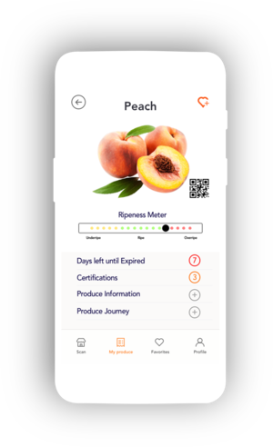
With a plan for the product’s branding and visual design, I iterated on mid-fidelity wireframes to design high-fidelity mockups of onboarding screens, the home screen, and product screens. Based on feedback, I designed additional screens where users could see the location on a map of the produce travel, product certifications, and general information of the produce with possible recipes.
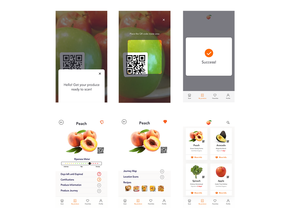
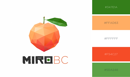
A product name — miroBC — emerged from a brainstorm of concepts and terms. miroBC thought of as a brand name that would convey health and wellness, a mirror of transparency, technology and knowledge in the current time, all of which were key elements of a positive informational experience.
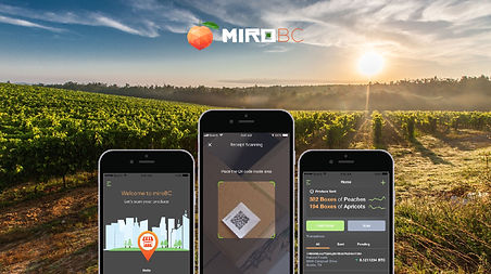
From there, I designed the high fidelity mockups using the brand guidelines as well as colors. This led to constructing the prototype of the app design for evaluation.
next steps
This case study represents the start for the development of this produce informational app experience. It would be necessary to conduct more usability testing in order to better understand how people engage with the product, identify more features to improve, and design a more user-friendly product for produce.